


How Are Conference Hall Seat Colors Chosen?
How Are Conference Hall Seat Colors Chosen?
Conference halls are professional spaces designed for seminars, congresses, presentations, educational events, and cultural organizations. Every detail in these venues directly affects the overall user experience, and seating design plays a major role in both comfort and aesthetics. How Are Conference Hall Seat Colors Chosen? Choosing the right conference hall seat colors is not only important for visual appeal but also for creating the right atmosphere and reinforcing the identity of the space.
The Purpose of the Venue Matters
One of the first factors to consider when selecting conference hall seat colors is the intended use of the venue. Conference halls used by government institutions or corporate organizations often prefer dark and formal colors such as navy blue, burgundy, anthracite, and black. These tones create a more professional and authoritative atmosphere.
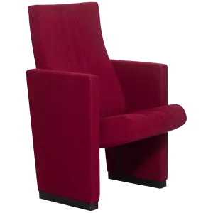
On the other hand, university auditoriums and modern event spaces may use more dynamic and contemporary colors. Cultural centers and theaters frequently choose red tones because they create a classic stage-focused ambiance and help maintain audience attention.
Venue Size and Lighting Conditions
The physical dimensions of the hall significantly influence color selection. In smaller conference halls, lighter-colored seats can make the venue feel more spacious and open. Larger auditoriums often benefit from darker tones that provide balance and a premium appearance.
Lighting is another critical element. In venues with limited natural or artificial lighting, extremely dark seating colors may create a dull atmosphere. In contrast, well-lit modern conference halls can successfully use darker tones to achieve a sophisticated and elegant design.
Harmony with Corporate Identity
For corporate conference halls, seat colors should align with the company’s brand identity and interior design concept. Matching seating colors with corporate branding creates visual consistency and strengthens the professional image of the venue.
For example, companies that use blue tones in their branding may prefer navy or gray-blue seating combinations. Coordination between seating, wall panels, flooring, curtains, and stage design also contributes to a more cohesive and modern architectural appearance.
Durability and Maintenance Considerations
Conference halls are high-traffic areas, which means functionality is just as important as aesthetics. Light-colored fabrics may show stains and wear more quickly, while darker colors often maintain a cleaner appearance over time.
For this reason, shades such as burgundy, dark gray, brown, and charcoal are widely preferred in auditoriums and conference centers. Additionally, modern seating systems frequently use stain-resistant and antibacterial fabric technologies to improve durability and hygiene.
Psychological and Acoustic Effects
Colors have a direct psychological impact on audience perception and concentration. Dark tones can create a more serious and focused environment, while brighter colors may increase energy and dynamism within the venue.
Educational and professional conference halls usually benefit from calm and neutral tones, whereas creative event spaces may incorporate more vibrant color combinations. The texture and tone of seating fabrics can also contribute to the perceived acoustic quality of the space, making professional interior planning highly valuable.
Selecting conference hall seat colors requires balancing aesthetics, functionality, lighting conditions, corporate identity, and long-term maintenance needs. The right seating color choices can transform a conference hall into a more prestigious, modern, and professional environment.
How Are Conference Hall Seat Colors Chosen?
Carefully planned seating designs not only improve the visual quality of the venue but also enhance audience comfort and overall user experience. For the best results, conference hall color planning should be carried out with professional architectural and interior design support.